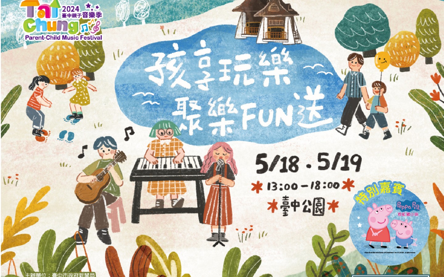
深圳華思品牌設計機構-中絲園(形象系統)
絲綢傳奇,韻致天成 中國絲綢文化產業創意園 (簡稱中絲園)是國家文化產業示範基地標誌旨在通過對傳統文化的意象表達,結合現代設計理念,象徵性、藝術化的演繹中絲園品牌形象。標誌整體形態如同一面迎風招展的旗幟,寓意了企業致力於打造中國絲綢高端品牌,獨樹一幟成為絲綢行業的引領者。展示出“中絲園”復興東方絲綢文化,重辟現代絲綢之路的宏偉理想和非凡氣魄。
標誌以甲骨文的“中”字作為主要創意元素,化具象為抽象,在點明中絲園企業名稱字首的同時,巧妙的將中華文明史和絲綢史相結合,簡明扼要的標示出數千年來中華絲綢文化的博大精深;形斷意連色彩斑斕的線性圖形,是對“絲”字淋漓盡致的藝術化演繹,而且也賦予了該標誌無盡的聯想空間:
經緯縱橫、千絲萬縷的絲織工藝;綿延不絕、上下千年的駝峰古道;峰巒疊嶂、錦繡如畫的萬里河山。至此,“中絲園”企業品牌形象卓然彰顯,大氣天成。
Silk legendary charm heaven silk culture industry creative park( referred to as the Silk Park of China) is a national cultural industry demonstration base Logo aims to express the image of the
traditional culture , combined with modern design, symbolic , artistic interpretation of the wire garden brand image. Flag fluttering in the breeze overall shape as the side of the flag , meaning
that the company is committed to creating high-end brands of Chinese silk , unique to become a leader in the silk industry . Revival show " Silk Garden " Oriental silk culture , re-provision of the
grand ideal of modern Silk Road and extraordinary courage .
Flag to Oracle's "China" as a major creative elements of the figurative to the abstract , in pointing to the corporate name prefix wire garden while cleverly history of Chinese civilization and the
history of silk combined with concise marked out thousands years of Chinese silk culture is profound ; shaped connected Meaning colorful linear pattern is a " silk" vividly artistic interpretation
of the word , but also gives the Lenovo logo endless space : Jingwei aspect , intricate silk craft ; Unbroken , Camelback Road and down for thousands of years ; Ridges and peaks , beautiful rivers
and mountains of the picturesque Miles .
At this point, " Silk Park of China" Zoran highlight the corporate brand image , atmospheric heaven.


林韶斌設計機構-桂林米粥
產品為桂林的有機大米,桂林山水甲天下,那裡的水質源好,米質優越。目標是讓消費者能通過設計一目了然,並識別出這是來自桂林的米粥。因此創新上應用了最為簡潔的表現方式,設計以“米”作為創意點,將一顆顆大小不一的米排成一排,中間拉出一條白線,構成了一幅桂林山水及倒影的風景畫,充滿詩情畫意,讓人觀看的時候享受著輕鬆愉悅的心情。整個造型簡潔大方,富有音樂的律動感,給人以想像的空間。在設計的過程中,做了大量的設計嘗試,有想過用用插畫或圖騰將當地的地域文化及特色描繪出來,但畫面過於豐富,失去了畫碘的簡潔有力的傳遞性。因此最終還是在原點""桂林和大米""去尋找方向。
The product is organic rice from Guilin. Guilin scenery is the best in the world. There have good water source, so have excellent quality rice. The goal is to allow consumers to stick out a mile
through the packaging design to identify this is gruel from Guilin. Therefore, innovation used the simplest way of expression. The design used the creativity spot by "the rice”. Take many sizes of
rice in a row. Put out a white line in the middle, constituted a landscape of scenery and inverted image of Guilin, filled in poetic and artistic flavor, when people watching enjoy a relaxed joyful
mood. Entire modeling succinct natural, fills the music frequency, gives the imaginative space for the people.
相關閱讀:
金點設計獎
http://bit.ly/1y9HtQL
相關網站:
金點設計獎官網:
http://www.goldenpin.org.tw/tw/
新一代設計展官網:
http://www.yodex.com.tw
金點新秀設計獎Facebook粉絲專頁:
https://www.facebook.com/YoungPinDesign
圖文提供/美商方策顧問有限公司台灣分公司;編輯/何凭融(何熊貝)
【本文授權範圍僅限於欣傳媒 請勿轉載】